Apple's Mac mini - Tempting PC Users Everywhere
by Anand Lal Shimpi on January 25, 2005 7:39 AM EST- Posted in
- Mac
A First Look at Pages
The idea behind Pages is to make document creation, layout and publishing easier than ever before. If you've ever used Word for anything above and beyond just a text editor, it often times have little quirks that can frustrate you after dealing with them for a while - such as footnotes that don't always work properly, an ornery table of contents or especially dealing with graphics and text boxes and getting them to not screw up the pagination of your document. Word is a very powerful word processor, but in all of its might, it has lost a considerable amount of simplicity. Then there are page layout and publishing applications that generally require a higher level of expertise than what the beginner user is going to have, and they are generally much more expensive than $79. So there is a need for something else. The question is whether or not Pages happens to be it.
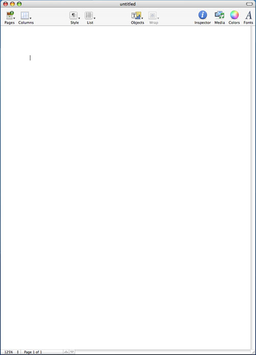
Before I get to the built-in templates within Pages, let me talk a bit about the interface. When you're first dropped into Pages, you immediately notice that the interface is extremely bare, almost to the point where it is bland. There is no font drop-down - all of the buttons you're used to seeing in a word processor or any application for that matter are all gone. There's a row of 10 oversized buttons at the top of the page and that's it.
![]()
The default view in Pages has no rules, no layout markers, nothing. You can turn all of those on, but for me, they unnecessarily clutter the interface to be on all the time.
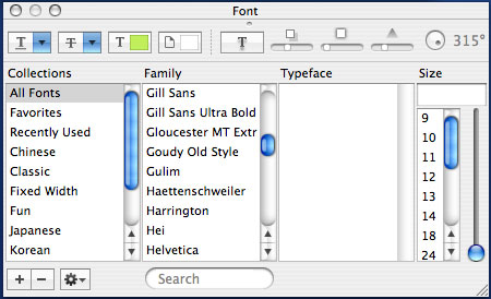
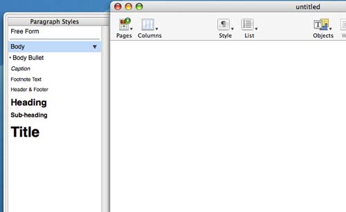
I mentioned that there is no font drop-down in Pages. Instead, in order to change the fonts and settings, you have to use the font panel, which you bring up by either hitting the button on the tool bar or hitting Command + T. Despite my initial reactions to it, I actually preferred Apple's decision here simply because I rarely adjusted my fonts when typing in Word; it was just something that I had expected to be in the toolbar and unnecessarily so. Font sizes are another thing, and this is one area where Pages encourages you to go in a much different route from what you may be used to. Normally, you create page or paragraph headers by either making the header bold or increasing the font size. You can obviously do the same using the font panel in Pages, but there is an alternative. Pages heavily encourages the use of styles for text, which are both pre-defined and user-definable.
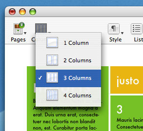
The other thing that Pages does extremely well is its handling of columns - there's a columns drop-down at the top of the page that will let you select from 1 - 4 columns. You can adjust the number of columns within any shape object or apply it to the document as a whole, quite easily.
Despite the relatively simple interface, there are quite a few controls offered within Pages, they just remain hidden until you bring up the Pages Inspector. The Inspector window is a small window that lets you adjust options for everything in Pages, as well as features things like document information. If there's anything that you need to do or find in Pages, it's in the Inspector.
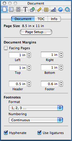
For example, if you want to define more than 4 columns, click on the column button in the Inspector. If you want to change how text wraps around objects, click on the appropriate button in the Inspector. Colors, tables, charts, everything is customizable from the Inspector - and when you're done, you can leave it on the desktop or hide it. You can also open up multiple Inspectors, each at a different settings page if you like having access to everything without bringing up more windows.
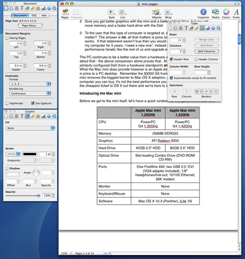
Multiple Inspectors


198 Comments
View All Comments
Ecgtheow - Tuesday, January 25, 2005 - link
#56: Probably not.sluramod - Tuesday, January 25, 2005 - link
Probably stupid question, but I'll ask anyway...Is Tiger upgrade going to be free for Panther users?
Alex
HardwareD00d - Tuesday, January 25, 2005 - link
the Mac Mini sounds like it would be a fun toy to play around with, but it's a bit too expensive for what you get. If you don't mind paying close to $600 for a screenless laptop, go for it. I personally hate laptops cause they have such crappy performance. They're only useful if your always on the go.msva124 - Tuesday, January 25, 2005 - link
Exactly #53. I can't see the word of mouth from all of the 256MB mini owners being too great, which is a shame because at 512MB it would have had a much better reputation.bob661 - Tuesday, January 25, 2005 - link
#35Unless the buyer is an AT reader or the salesman is an AT reader or the Best Buy ad says buy the extra 256MB of ram, they'll buy the unit at $499 without upgrades. Unless they specify the extras or a salesman suggests getting some extras, they'll get the unit as is. If it gets too much over $499, they'll choke and go get a Dell with the "free" flat panel. Like #32 said, cost and name. I guess it really is hard for some of you to imagine yourselves as a typical computer buyer.
downtowncb - Tuesday, January 25, 2005 - link
Anand concedes:"Working as a simple file, ftp or web server with no end user interaction in the OS, you can get by with a 256MB configuration, and the same goes for a single user, single application usage environment..."
I know that most of the people here would never dream of using a machine with only 256 MB of RAM, but for a few people 256 MB is enough, especially those who just need a cheap, reliable web server that they can stick in the basement and administer with VNC or even ssh.
MIDIman - Tuesday, January 25, 2005 - link
I'm not sure if this has been mentioned above, but I think a smaller system, along the lines of something at mini-itx.com's store front would be a more useful comparison than the stock Dell. It would allow a better representation when you take size into the comparison.IMHO - when these two are put side-by-side, you'll find similar performance issues as well - i.e. needs for 512mb, a faster HD, etc.
elvisizer - Tuesday, January 25, 2005 - link
48, that might be it- i always keep my pictures huge, since I don't have a webpage of my own like anand :)sprockkets - Tuesday, January 25, 2005 - link
Perhaps the applications alone are worth me trying a Mac Mini. BUT, more ram, and use Hitachi's 7200RPM hdd and that will make it MUCH better.Then again, I rather just use apps on a completely GPL system rather than a proprietary system. If only it was easier to find more PM itx systems, a PM system in a cubit case would appeeal more to me.
jasonsRX7 - Tuesday, January 25, 2005 - link
I get the feeling that he's using export to resize the pictures for the web. Just dragging them out of iPhoto will retain their original size.